- April 16, 2015
- Posted by: Wevio
- Category: Development, Wevio Blog

There is no doubt that Responsive Web Design is very important for from a web designers’ point of view.
Smartphone and tablet adoption has rapidly increased contributing towards the importance of mobile-friendly websites. Smartphones and tablets have changed the approach toward design and user experience. Before the spread of mobile devices with advanced web-browsing capability, web designers had only one primary challenge to deal with. As a result a lot of website ended up with the same look and feel. However, interacting with websites on smartphones and tablets is not the same the same experience as a desktop computer.
If SEO is a core component of your digital marketing strategy, having a mobile–friendly website is becoming essential. Mobile sales have already overtaken desktop sales, and mobile Internet usage is predicted to overtake desktop internet usage by 2014. It is only logical that mobile search will overtake desktop search at some point in the near future as well.
What is Responsive Web Design?
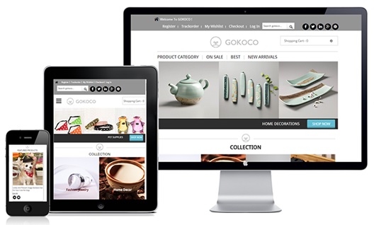
Responsive web design (RWD) is an approach to web design aimed at crafting sites to provide an optimal viewing experience, easy reading and navigation with a minimum of resizing, panning, and scrolling across a wide range of devices (from desktop computer monitors to mobile phones).
Responsive Web Design (RWD) is an approach of laying-out and coding a website such that the website provides an optimal viewing experience — ease of reading and navigation with a minimum of resizing, panning, and scrolling — across a wide range of devices (from desktop computer monitors to mobile phones).
 Advantages of Responsive Design
Responsive web design sites are fluid, meaning the content moves freely across all screen resolutions and all devices. Both the grids and the images are fluid. Just as a liquid spreads out or draws in to allow its content to fill an allotted space and retain its appearance, responsive web design’s fluidity achieves the same result with website content on a device screen.
Excellent User Experience
While, content is king and discover ability of content are foremost success metrics, it is the user experience that enables visitors to consume content on any website through the device of their choice and preference, anytime. Thus, responsive web design is about providing the optimal user experience irrespective of whether they use a desktop computer, a smartphone, a tablet or a smart-TV. Responsive web design accommodates the busy professional during the day and the wide-awake college student needing access to your site anytime. No scrolling or resizing is needed for any visitor to access your website from their favorite device.
Cost Effective
The advantages of having a single site that conforms to the need of all devices are significant when compared to having two separate websites. One website costs less than two, and the savings can be substantial. Sites designed solely for mobile device traffic do not offer the advanced navigational techniques found in traditional websites, and they also require the user to maintain two separate web addresses for your site. This is inconvenient for most people and can cause them to websites that provide a better user experience. Responsive web design enhances SEO efforts by having all your visitors directed to a single site regardless of their preferred device.
It is Recommended By Google
Google’s Pierre Farr went on the record to declare that Google prefers responsive web design over mobile templates. Having one single URL makes it easier for a Google bot to crawl your site as well as reducing the chance of on-page SEO errors. For these reasons, responsive sites typically perform better and are easier to maintain than a separate, mobile-template site.
This is because responsive design sites have one URL and the same HTML, regardless of device, which makes it easier and more efficient for Google to crawl, index, and organize content. Contrast this with a separate mobile site which has a different URL and different HTML than its desktop counterpart, requiring Google to crawl and index multiple versions of the same site.
Conclusion:
Responsive design is pretty cool. You can drag and drop the browser window smaller and bigger and watch the website content change according to the size of the window. But just because you can do something doesn’t necessarily mean you should. Responsive design has its place but doesn’t mean it should be used in all places.
