- September 1, 2017
- Posted by: Wevio
- Category: Development

UI a Mover
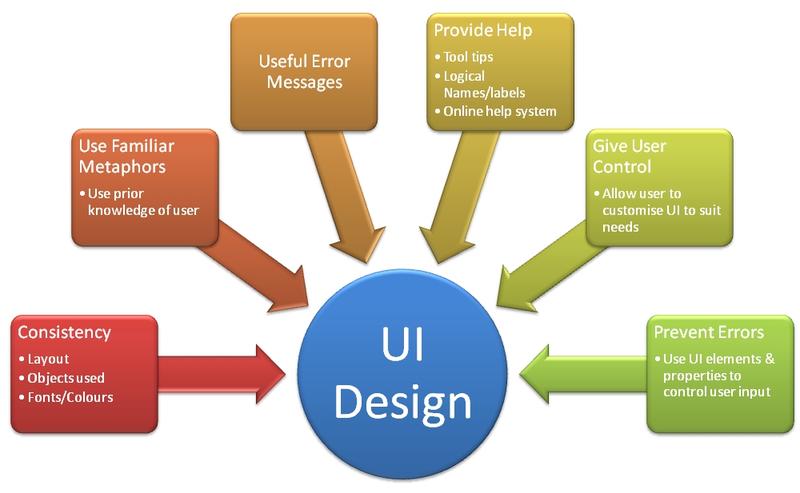
User interface is something which keeps changing from time to time and there is no doubt a lot research and development goes into it everyday and it is the only thing which accounts for 40-60% of consumer experience alone, it is always advisable to focus on the UI as that is something that can drive the growth to next level. A few top UI features of 2017 are.

Sumptuous Full Screen
Users today are expecting more from the technology and technology is something which keeps changing, companies are taking this matter seriously and have put efforts to make bezel-free screen which have full screen option making the whole video a lot better.
Gradient and Vivid Colour
Flat screen which was introduced in 2013 for the first time but now kind of taken its place all over the ground, it was a transformational and revolutionary change but there were number of flaws out of which one was of dull colour and low colour profile which has been overlooked since and that is one of the things that UI designs have worked upon. Better colour and no more dull mute colours is making things better not only for web applications but also for the offline usage.
Illustrations
It is of utmost importance to improve the understanding of users by providing them better illustrations in the form of animated images and pictures, UI designers have been working to introduce tailor-made illustrations for the user’s convenience.

Breaking limits overcoming Grid
Grid plays an important role in the user experience and help the users to have better navigation system in place, UI designers have all their way working on this one thing and we all get to see changes almost every time. Outplaying the normal grid pushes the users every year.
Parallax
This is not a new mechanics but yes the right implementation has been observed now, it is of sheer importance to not play with this feature as it could be overbearing, all this feature does is to slow down the background movement in comparison to foreground which effects the User Interface.
More Cards
Not a breakthrough but surely an improvement, for having it embedded in the hotel websites to help users navigate through the rooms and facilities easily, and having it embedded in the e-tailing websites to better the consumer experience, it has moved things at a faster pace now.
Micro Interactions
The user experience had taken a whole better shape with the introduction of Micro Interactive buttons in the websites and in mobile apps, it has really helped changing the user’s way of navigating, and now as nothing is constant, the micro interaction has changed into better 3d versions.
Typography
As we all are inclined towards reading and writing a lot, typography plays an important role in changing the user experience by making the words more appealing and letting the users understand things in a creative manner, more and more text can make the user feel numb but with great fonts and attractive size of text the consumers are enthralled.
Experimental Navigating
Navigations forms a big part of day to day user experience and thus it is a long discussed topic among the UI designers, they all want to make at least this one thing very easy in their models to better the user experience and thus they came up with different types of navigations and helping the user find whatever he expects in just one place without much scrolling and without much pain to their eyes. They have propounded small image like navigation bar which has several icons for various functions.
So these are a few trending User Interface features which are moving with time and bringing a whole new experience for the users and making them feel they are the king. Let us not get carried away and conclude with a thoughtful note “User Interface is not the key to sale or sole money generation but it is the whole engagement which keeps the user intact with the system”.
